You did everything the marketing gurus told you to do. You identified your target audience, created a free resource, and put a link in your bio. You sit back, ready for the email subscribers to roll in.
But a week goes by, and your dashboard shows an agonizing reality: plenty of page views, but a conversion rate hovering near zero.
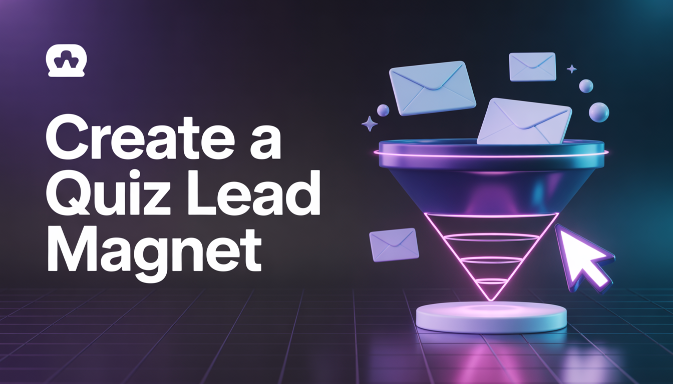
If your lead magnet isn’t turning visitors into subscribers, the problem usually isn’t your traffic. The problem is how you are presenting the offer. Here are the three most common mistakes creators and entrepreneurs make with their lead magnets—and exactly how to fix them today.
Mistake 1: You Are Trying to Solve Too Many Problems
The biggest trap creators fall into is trying to be too helpful. You create “The Ultimate A-Z Guide to Digital Marketing” or “The Complete 50-Page Blueprint for Life Coaching.”
While packed with value, these massive resources overwhelm visitors. People don’t want more homework; they want a quick win. If your lead magnet requires a weekend to consume, your audience will simply scroll past it.
The Fix: Shrink the scope. Focus on solving one specific problem for one specific type of person. Instead of “The Ultimate Guide to Fitness,” offer a “5-Minute Morning Mobility Routine for Desk Workers.” Hyper-specific, actionable solutions always convert higher than broad, sprawling guides.
Mistake 2: The “Perceived Value” is Too Low
We like to think people don’t judge a book by its cover, but on the internet, they absolutely do.
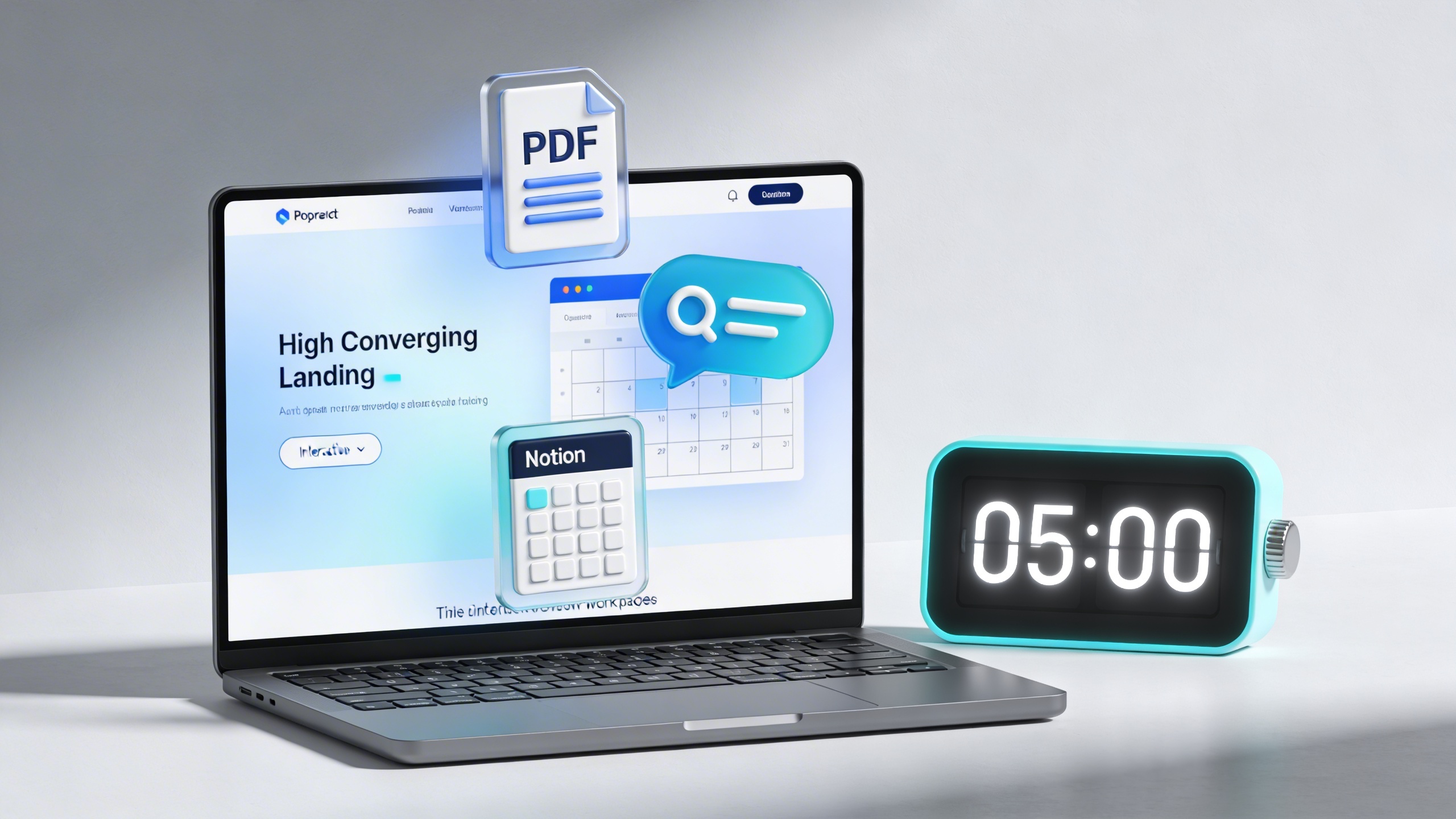
If your lead magnet is a plain, unformatted Google Doc or a messy PDF with typos, it sends a subconscious signal about the quality of your paid products or services. Even if the information inside is life-changing, poor design destroys trust. Your audience is exchanging their valuable personal information (their email address) for your asset. It needs to look like it is worth paying for.
The Fix: Elevate the packaging. Your lead magnet should look like a premium digital product. Use clean typography, professional formatting, and clear visual hierarchy. When your free content looks better than your competitors’ paid content, capturing leads becomes effortless.
Mistake 3: Your Landing Page is Full of Friction
Your visitor clicked the link. They want the resource. But then they land on a page that takes five seconds to load, has a distracting navigation menu, and asks for their First Name, Last Name, Phone Number, Company Size, and Blood Type.
Every extra field on your opt-in form and every distracting link on your landing page is a leak in your funnel. We call this “friction.”
The Fix: Ruthlessly simplify the opt-in process.
- Remove the navigation bar: A landing page should only have one exit—the subscribe button.
- Minimize form fields: If you only need their email to deliver the asset, only ask for their email. You can gather more information later once they are in your ecosystem.
- Strengthen the CTA: Change your button from a generic “Submit” to an action-oriented phrase like “Send Me the Free Checklist.”
The Takeaway
Auditing your lead generation strategy doesn’t have to mean starting from scratch. By narrowing your focus to a single problem, upgrading the visual quality of your asset, and removing friction from your landing page, you can dramatically increase the number of visitors who gladly hand over their email address.
Stop treating your lead magnet like an afterthought. Treat it like the front door to your business.